1.2 Reaction and Aftermath
Public Reaction to the Denomination
As stories of the new denomination were publicized in local and regional papers, the government made much promise that the silver twenty-cent piece would solve the “bit” dilemma
entrenching the western states. Soon, patrons and merchants would no longer be faced with the inability to tender or make proper change and all would be happy. Such would not
be the case as the public did not welcome the coins.
Even before the denomination was struck, editorial commentary was not favorable. Initially, the rhetoric was against the idea of a new denomination when increasing production of
the dime and minor coinage appeared to be a logical solution to a shortage of small change. Soon it appeared as if there was an even more visceral dislike by those living in the
eastern states against something perceived as specifically made for those on the opposite coast.
|
California rejects our five-cent pieces as rather beneath her notice. Consequently, somebody often loses that amount in making
change, and it has been suggested that a twenty-cent piece be coined for the convenience of the Pacific Coast. But if our five-cent
piece is good enough for the other States, why isn’t it good enough for California?
Harper’s Weekly December 19, 1874 |
It was clear that the desire of those in the West to use the “real money” of gold and silver was not equally embraced by citizens in the East. In the West where so much of these metals
had been discovered, the fervor for using gold and silver in business transactions was natural and expected. In the eastern states, minor coinage and paper notes were commonly accepted
without much notice and citizens from our most cultured eastern cities were perplexed by lack of acceptance of our government’s money, even if not made of gold or silver.
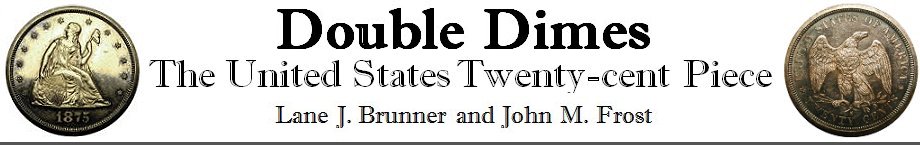
The following is an assayer chart, listing the various U.S. silver and gold coin denominations along with their weights and other relevant information. Note that the chart has an entry
for the brand new twenty-cent coin, but did not yet have the specifications, and thus they were written in by hand at a later time.
Design Complaints
Modern collectors often complain about the lackluster and unimaginative designs of our contemporary coinage. Such complaints, however, are not new and seemed to reflect a common affection
for the designs of earlier times. When the twenty-cent piece was issued, the Liberty Seated design had been on our coinage for about four decades. Once considered a design of wonderful
artistic appeal, it was apparent that appreciation of the design’s beauty was now dwindling. During our centennial year, several commentaries were printed that were a call for fresh designs.
|
Look at the uninteresting and lifeless Goddess of Liberty, with a scared look and shapeless arm, of a twenty cent silver piece,
and compare it with the striking and lifelike features of a 1793 wreath or ring cent, any further comments will be unnecessary.
The Coin Collector’s Journal March 1876 |
|
Now that we see real money again our attention is naturally attracted by its appearance, the look of it. That is pleasant enough in one respect.
A bright silver piece, no matter what design is stamped upon it, is a much more attractive thing than a little scrap of paper, generally crumpled
and greasy. But now that we see our national money again, notwithstanding all our reasons for welcoming it, we must confess that it is not as
handsome as it ought to be, as it might be, or even as it once was. It does us no credit as an exhibition of our skill in designing, in die sinking,
or coining. Why is it that we have the ugliest money of all civilized nations? For such undoubtedly our silver coinage is. The design is poor,
commonplace, tasteless, characterless, and the execution is like thereunto. Our silver coins do not even look like money. They have rather the
appearance of tokens or mean medals. One reason of this is that the design is so inartistic and so insignificant. That young woman sitting on
nothing in particular, wearing nothing to speak of, looking over her shoulder at nothing imaginable, and bearing in her left hand something that
looks like a broomstick with a woollen night-cap on it—what is she doing there? What is the meaning of her? She is Liberty, we are told, and
there is a label to that effect across a shield at her right, her need of which is not in any way manifest. But she might as well be anything
else as Liberty; and at the first glance she looks much more like a spinster in her smock, with a distaff in her hand. Such a figure has no proper
place upon a coin. On the reverse the eagle has the contrary fault of being too natural, too much like a real eagle. In numismatic art animals
have conventional forms, which are far more pleasing and effective than the most careful and exact imitation of nature can be. Compare one of our
silver coins with those of Great Britain, France, or Germany, and see how mean, slight, flimsy, inartistic, and unmoneylike it looks. Our coins of
forty or fifty years ago were much better in every respect, and looked much more like money, the reason being that they bore a bead of Liberty which
was bold, clear, and well defined in comparison with the weak thing that the mint has given us for the last thirty years or so. The eagle too, although
erring on the side of naturalness, was more suited in design to coinage. But still better were the coins struck at the end of the last century and
the beginning of this one. The eagle was a real heraldic eagle, the head of Liberty had more character, and the whole work was bolder and better
in every way.
The Galaxy June 1876 |
|
Such a figure [Liberty Seated] it is well urged, has no proper place upon a coin. It is a medallic figure; and even as such it is
a very poor thing, altogether without beauty in itself and without meaning. And the eagle on the reverse is an almost ridiculous
attempt to represent a natural eagle in a realistic way—a thing impossible in coinage and undesirable if possible.
The Coin Collector’s Journal June 1876 |
|
Since the designs of our coinage cannot possibly sink to still lower grades without approximating the rude efforts of the middle ages,
let us hope that the important subject will receive from Congress at an early date the attention which it deserves.
The Coin Collector’s Journal June 1876 |
|
The provisions of the above bill [prescribing the devices and inscriptions on United States coinage], introduced by
Senator Sherman, of Ohio, if adopted, and faithfully carried out, will tend to remedy, to a certain extent at least, the abuses which
have gradually crept into our national coinage. We are only sorry that its provisions are not so distinct as to admit but one
construction; and fear that, with the present administration at the Mint, the spirit of the bill aimed at the low standard of design
and execution of our coins, may still be violated, even though the letter executed. There is no doubt that splendid work can be performed at our mints, but the artists employed appear to concentrate their efforts to display their talents on outside jobs, such as getting up an striking of private medals, etc., while the work for which they are employed, and we believe paid, lies neglected or is disposed of with as little trouble as possible. The Coin Collector’s Journal July 1876 |
There was little doubt that when the twenty-cent piece was introduced, the Liberty Seated design was out of favor. Perhaps if a novel obverse design was adopted,
like one of the artistic patterns, the denomination would have had a fighting chance with the public and remained in commerce. A new denomination with the same old
Liberty Seated design was doomed from the start.
Public Confusion...