1875
As the debate continued about the need for a silver twenty-cent coin, additional patterns were created to demonstrate alternative design ideas. In addition to the final
selected design, six different die combinations illustrating a number of design concepts were produced.
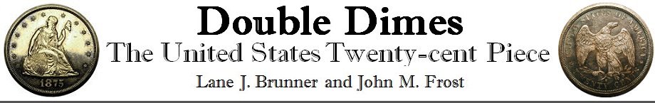
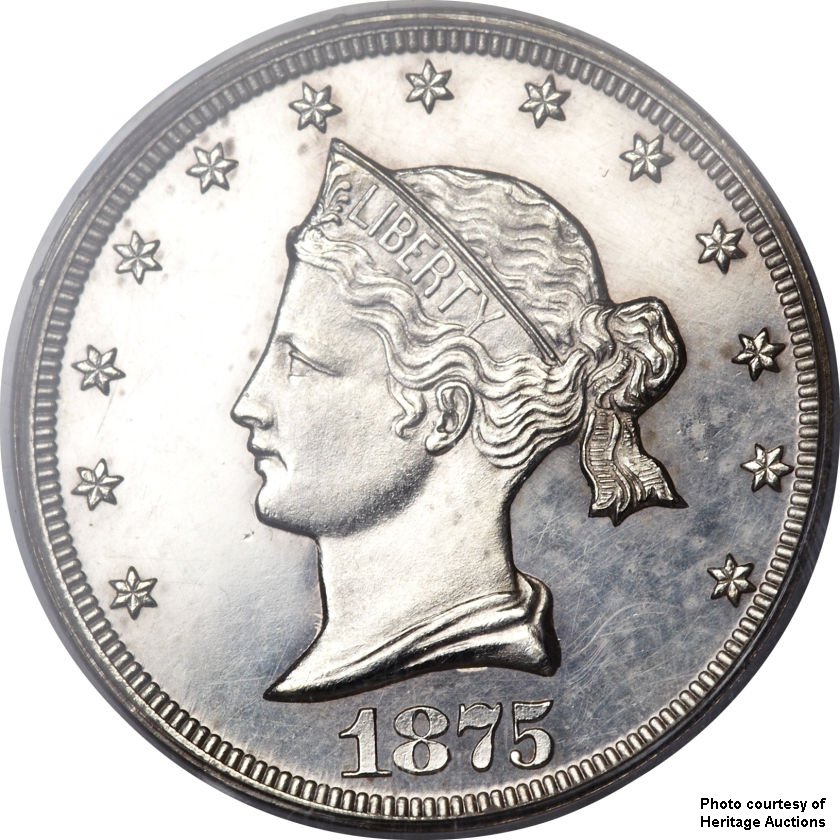
Chief Engraver William Barber introduced his so-called “Sailor Head” design on one of these patterns, a motif that would also make its way onto the Half Eagle and Eagle
patterns of the same year. The reverse sported a shield with an incuse “20” across its face. The word CENTS appeared below the shield, and UNITED STATES OF AMERICA
adorned the top perimeter of the reverse. The patterns were struck in silver, copper, aluminum, and nickel.
 |
 |
|
William Barber’s “Sailor Head” design9 |
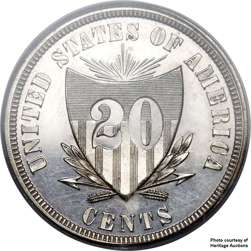
Barber next created an obverse design that has become known as “Liberty at the seashore,” reminiscent of his Trade dollar design, but with some key differences. Liberty is seated looking west over the ocean, holding an olive branch, sitting on a globe. A ribbon with “LIBERTY” adorns the globe, and she is surrounded by a bundle of wheat and two flags on masts. One noticeable addition to the design is found on the ocean – the presence of a rigged steamship in the distance, with its sails billowing in the wind, and smoke emitting from two smokestacks.
One interesting aspect to this pattern design is that the smoke is blowing in the opposite direction to what the sails would indicate, generally considered one of the more amazing blunders
in coin design. This has been referred to as the “illogical ship” in The Official RED BOOK, United States Pattern Coins, updated editions of Dr. Judd’s work. Interestingly,
while not likely to be seen very often, this phenomenon is technically possible. At right: "Liberty at the Seashore" obverse |
 |
This new obverse design was to be paired with three different reverses:
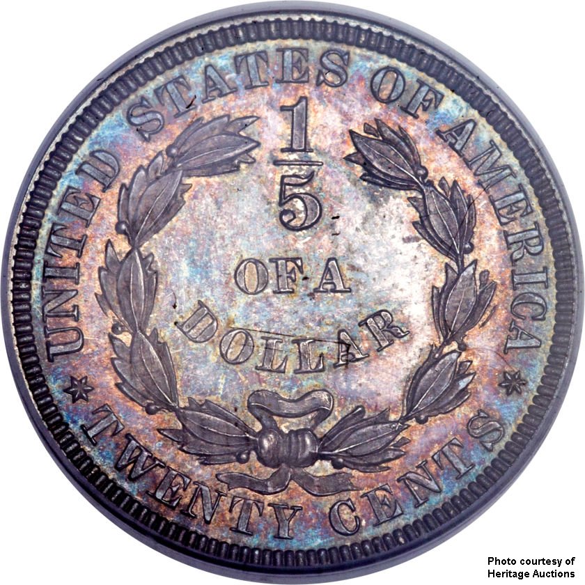
The first of these was reminiscent of Thomas Jefferson’s original decimal system proposal for our coinage, and the reference to the “tenth” (“disme”) and the
“fifth” (“double-disme”). Prominent in the center of this reverse design are the words “1/5 OF A DOLLAR” within a wreath. Interestingly, the words TWENTY CENTS
also lie below the wreath, thus producing a design where the denomination is on the reverse twice.
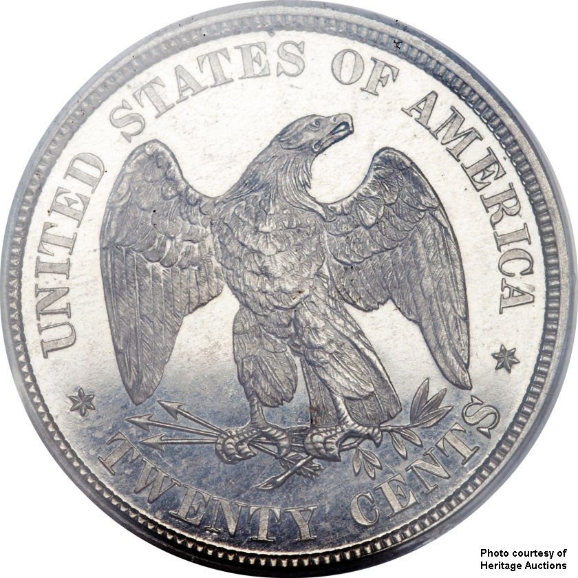
The second combination uses the first 1874 pattern reverse (the eagle design), similar to that on the Trade dollar, and close to what was eventually adopted on the twenty-cent piece.
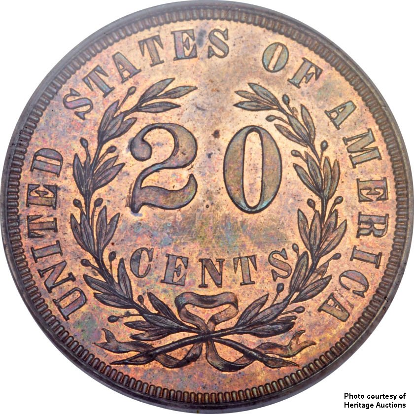
A third reverse paired with the Seashore design consisted of the second 1874 reverse, with the words 20 CENTS within a laurel wreath.
 |
 |
 |
||
|
(Click thumbnails for full size images) |
Still another pattern was to be created, this time pairing the Barber rendition of Christian Gobrecht’s Liberty Seated design, then appearing on the dime, quarter, and half dollar.
Like these other coins, the word LIBERTY on the shield was incuse. The reverse of this pattern reprised the 1/5 OF A DOLLAR design.
Finally, with the passage of the Act of March 1875 formally authorizing the coin, the required design elements were specified, and Linderman wrote to Pollack once again with instructions.
March 3, 1875
To: James Pollock
Sir:
Under the Act of March 3, 1875 authorizing the coinage of the 20 cent piece of silver at the Mints of the United States, provision is made that it shall be coined conformably in all respects to the Coinage Act of 1873 and that it shall be of the weight of five grams.
The deviation from standard with is not to exceed one and one half grains in each piece, and in weighing a large number of pieces together in deliveries — the deviation from standard weight must not exceed 2/100’s of an ounce in 1000 pieces.
A strict construction of the 18th section of the Coinage Act of 1873 requires an impression emblematic of liberty with the inscription of the word “Liberty” and year of coinage to be placed on the obverse of this coin and a figure of an eagle with the inscriptions United States of America and E. Pluribus Unum and the designation of he value of the coin on the reverse. It will be difficult however to place both inscriptions on the reverse and if it be found impracticable, we will be compelled to omit the latter.
I have to request that you will cause to be immediately prepared a specimen 20 cent coin as follows:
Obverse: — The same device as on the 50 cent, 25 cent and 10 cent.
Reverse: — Precisely the same as the reverse of the 20 cent specimen struck in 1874, using that die for the purpose.
If in the opinion of yourself and the engraver, the motto “E. Pluribus Unum” can be inscribed on the reverse without destroying the artistic and symmetrical arrangement, you will add the inscription . . .
H. R. Linderman
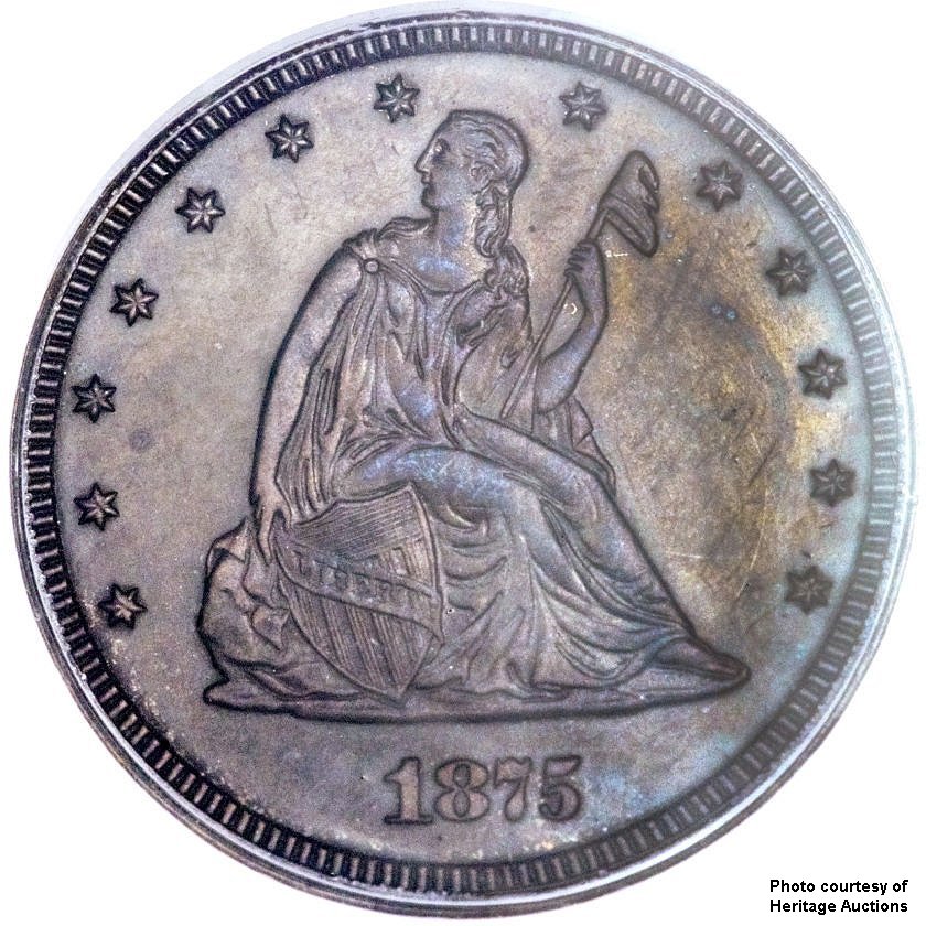
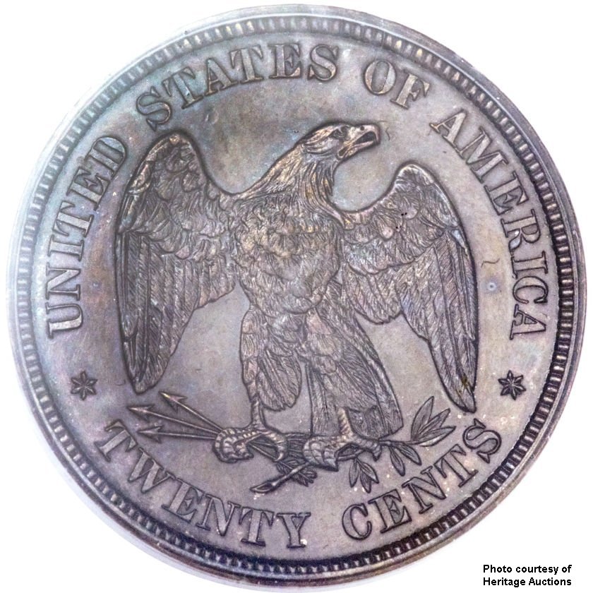
Responding to this letter, Pollack and Barber produced the final pattern, using the Liberty Seated obverse figure (with LIBERTY incuse on the shield), paired with the original eagle reverse from 1874.
 |
 |
|
The final pattern |
With the final pattern in hand, it was painfully clear that this coin would be a challenge to differentiate from the quarter dollar. Because the Mint Act had specified the design elements,
such confusion could not be avoided completely. To provide some additional assistance, the word LIBERTY on the shield was changed from incuse letters to raised, and made somewhat larger in
size at the same time. It may have been hoped that this small change would be of help differentiating from the quarter, but this was in vain. Because the raised word LIBERTY was on the
shield and became a new high point in the design, it was subject to immediate wear.
At the same time, the date was made larger, and some very subtle modifications were made to the reverse design, with changes to the positioning of the arrows (especially the tips) and the
shape and position of the branch and leaves. Given the purpose of revised design, it is unclear why these minor modifications to the reverse were made.
With the final design in place, the coin was ready for production. A few die trials in copper and aluminum, using the production dies, were made, apparently for sale to collectors, who
often desired off-metal examples of our coins, and had been given a steady supply for years, in all denominations. While not true patterns per se, they are normally included with the
other patterns of the twenty-cent piece.
Scarcity and Pattern Collecting...
9Photos of all the 1875 patterns, with the exception of the circulated example, are couirtesy of Heritage Auctions.